
The digital landscape has a clear frontrunner: mobile. As smartphones become the primary lens through which many users view your website, optimizing your WordPress theme for mobile users is no longer a recommendation, but a fundamental necessity for success. This guide explores exactly why mobile optimization is critical and provides actionable strategies to ensure your WordPress site delivers a flawless mobile experience, keeping you ahead of the curve.
Table of Contents
ToggleRecent statistics paint a vivid picture: over 62.7% of all internet traffic now originates from mobile devices (StatCounter). If your site isn’t primed for these users, you’re inadvertently turning away a majority of your potential audience. But the good news? Mastering mobile optimization for your WordPress theme doesn’t just help you adapt: it empowers you to lead.
Defining WordPress Mobile Optimization for Your Theme
Mobile optimization for WordPress themes transcends simply having a site that “shrinks to fit” a smaller screen. It involves a comprehensive approach to ensure that your website is not only responsive (adapting its layout fluidly to various screen sizes and orientations) but also fast-loading, easy to navigate, and highly interactive on mobile devices.
This means considering:
- Responsive Design: The theme’s ability to intelligently adjust content, images, and navigational elements.
- Page Speed: How quickly your pages load on mobile networks, which can often be slower than desktop connections.
- User Experience (UX): Ensuring intuitive navigation, readable text, touch-friendly targets (like buttons and links), and an overall frustration-free experience.
- Accessibility: Making sure your site is usable by people with diverse abilities on their mobile devices.
Think of it this way: just as AI is revolutionizing fields like SEO, a dedicated mobile-first approach is revolutionizing web design and user engagement. It’s about crafting an experience tailored to the on-the-go user.
Why Prioritizing WordPress Mobile Optimization is Crucial
The imperative for optimizing your WordPress theme for mobile users is backed by compelling data and clear benefits
Increased Reach and Audience: With the majority of users Browse on mobile, a mobile-optimized site ensures you’re accessible to the widest possible audience.
Neglecting mobile optimization is akin to closing your doors to a significant portion of your potential customers and readers.
Key Strategies for Optimizing Your WordPress Theme for Mobile Users
Achieving a stellar mobile experience involves several key strategies. While modern themes often provide a great foundation, proactive optimization can elevate your site further.
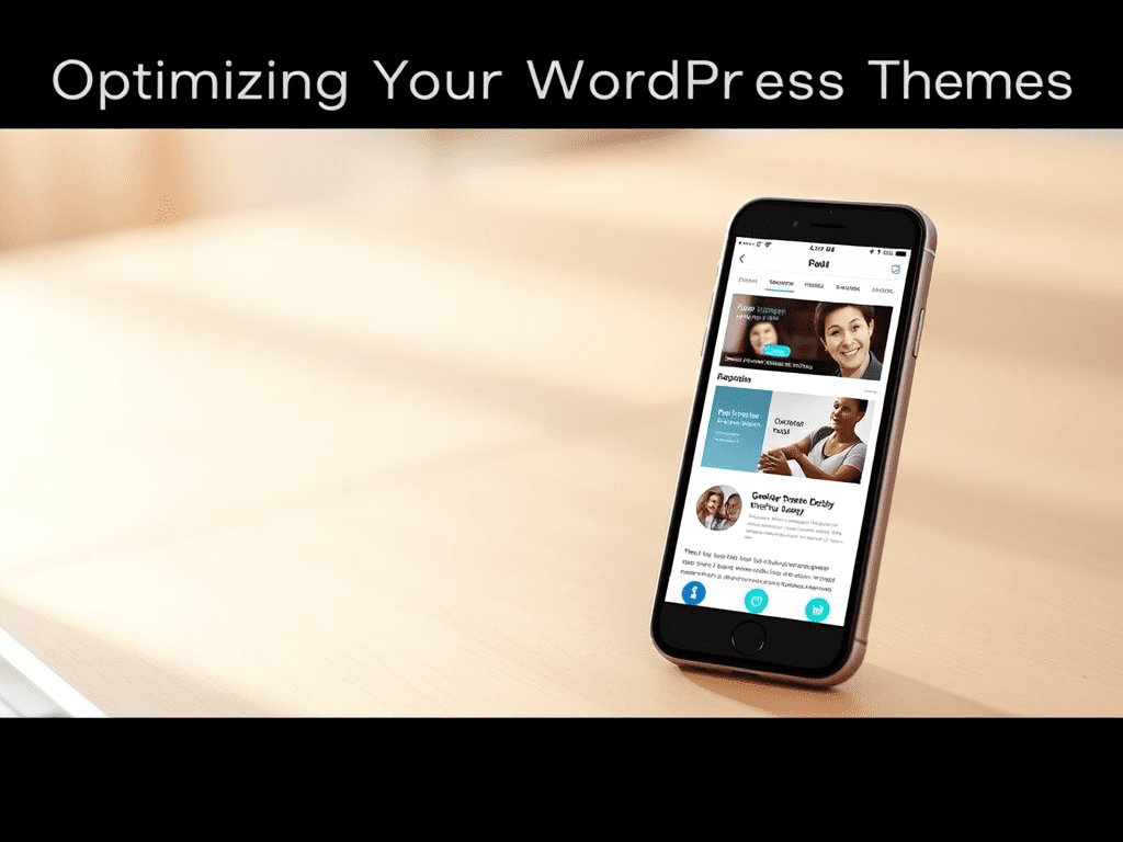
1. Mobile-Responsive Design: The Foundation for Optimizing WordPress for Mobile
The cornerstone of mobile optimization is a responsive theme. This means the theme is coded to automatically adjust its layout, font sizes, and image scaling based on the device’s screen dimensions.
This is where themes like Brikk and Heilz from Utillz truly shine. They are meticulously built from the ground up with responsive design at their core, ensuring your content adapts beautifully and intuitively to any screen size. For instance, Brikk, our versatile directory and listing WordPress theme, features an “intelligent responsive system” that automatically optimizes your content for mobile, tablet, and desktop viewing, ensuring a seamless experience. It’s even described as having a “mobile app-view for even better responsiveness.”
Similarly, Heilz, our powerful WordPress theme for digital downloads and marketplaces, is engineered for an “absolutely amazing on mobile” experience. It automatically adapts to any screen size while maintaining peak performance and even includes innovative features like a dedicated mobile action bar for uniquely fast and intuitive user navigation on smaller devices. Both themes also integrate seamlessly with page builders like Elementor, allowing for granular control over mobile-specific layouts if desired.
Even with such robust themes, it’s good practice to always test your site’s appearance on various mobile devices.
2. Supercharge Mobile Speed: A Facet of WordPress Mobile Optimization
Mobile users are notoriously impatient. Slow loading times are a primary reason for site abandonment.
- Optimize Images: This is crucial. Compress images using tools like TinyPNG or plugins. Use modern image formats like WebP where possible. Ensure your theme serves appropriately sized images for mobile devices (responsive images).
- Leverage Browser Caching: Caching plugins (e.g., WP Rocket, W3 Total Cache) store parts of your website so they load faster for returning visitors.
- Minify CSS, JavaScript, and HTML: Remove unnecessary characters from code without affecting functionality. Plugins like Autoptimize can help.
- Consider a Content Delivery Network (CDN): CDNs distribute your site’s static files across multiple servers globally, so content is delivered from the server closest to the user, reducing load times.
3. Rethinking Navigation to Optimize WordPress for Mobile
Desktop navigation menus often don’t translate well to mobile. Complex, multi-level dropdowns can be cumbersome.
- Simplify Menus: Use clear, concise labels. Prioritize essential navigation links.
- Implement Hamburger Menus: This common mobile pattern tucks the menu away until tapped, saving screen real estate.
- Ensure Clear Calls-to-Action (CTAs): Make your CTAs prominent and easy to tap.
- Themes like Heilz address this proactively with its innovative ‘mobile action bar,’ designed to provide quick, thumb-friendly access to essential functions and notifications on mobile devices, significantly enhancing the user journey.
4. Content Readability: A Pillar of WordPress Mobile Optimization
Reading extensive text on a small screen can be challenging.
- Legible Fonts: Choose clear, readable fonts and ensure appropriate font sizes for mobile.
- Sufficient Contrast: Ensure good contrast between text and background.
- Break Up Text: Use shorter paragraphs, bullet points, numbered lists, and clear headings to improve scannability.
- Touch-Friendly Targets: Ensure buttons, links, and form fields are large enough to be easily tapped without accidental clicks. Provide ample spacing around interactive elements.
5. Testing Your WordPress Mobile Optimization Efforts
Never assume your site is mobile-friendly. Rigorous testing is key.
- Google’s Mobile-Friendly Test: A quick way to see if Google considers your page mobile-friendly.
- Google PageSpeed Insights: Provides insights into your site’s mobile (and desktop) performance, along with recommendations.
- Browser Developer Tools: Most modern browsers (like Chrome, Firefox) have built-in tools to simulate various mobile devices.
- Real Device Testing: If possible, test your site on a variety of actual smartphones and tablets to catch any device-specific quirks.
6. Advanced WordPress Mobile Optimization Techniques
- Accelerated Mobile Pages (AMP): A framework from Google to create super-fast loading mobile pages. While it can significantly boost speed, it may limit some design/functionality and requires careful implementation. It’s not always necessary if your responsive theme is already well-optimized.
Utillz Themes: Ensuring Your WordPress is Optimized for Mobile
At Utillz, we understand that a superior mobile experience is paramount. That’s why our WordPress themes, such as the Brikk directory and listing theme and the Heilz digital marketplace theme, are engineered with a mobile-first philosophy. They provide a robust, responsive, and feature-rich foundation designed to captivate your audience, regardless of the device they use.
While these themes handle much of the intricate work of mobile responsiveness and offer unique mobile-centric features out-of-the-box, applying the additional optimization tips discussed in this post can further refine your users’ experience and boost your site’s overall performance and search engine visibility.
Succeeding by Optimizing Your WordPress Theme for Mobile Users
Optimizing your WordPress theme for mobile users is no longer a mere checkbox on a long list of web development tasks; it’s a strategic imperative for growth, engagement, and online success. By prioritizing a responsive design, lightning-fast load times, intuitive navigation, and mobile-friendly content, you’re not just adapting to a trend—you’re investing in a better experience for your audience and a stronger future for your online presence.
Start with a powerful, mobile-centric theme, diligently apply these best practices, and watch your mobile engagement soar.