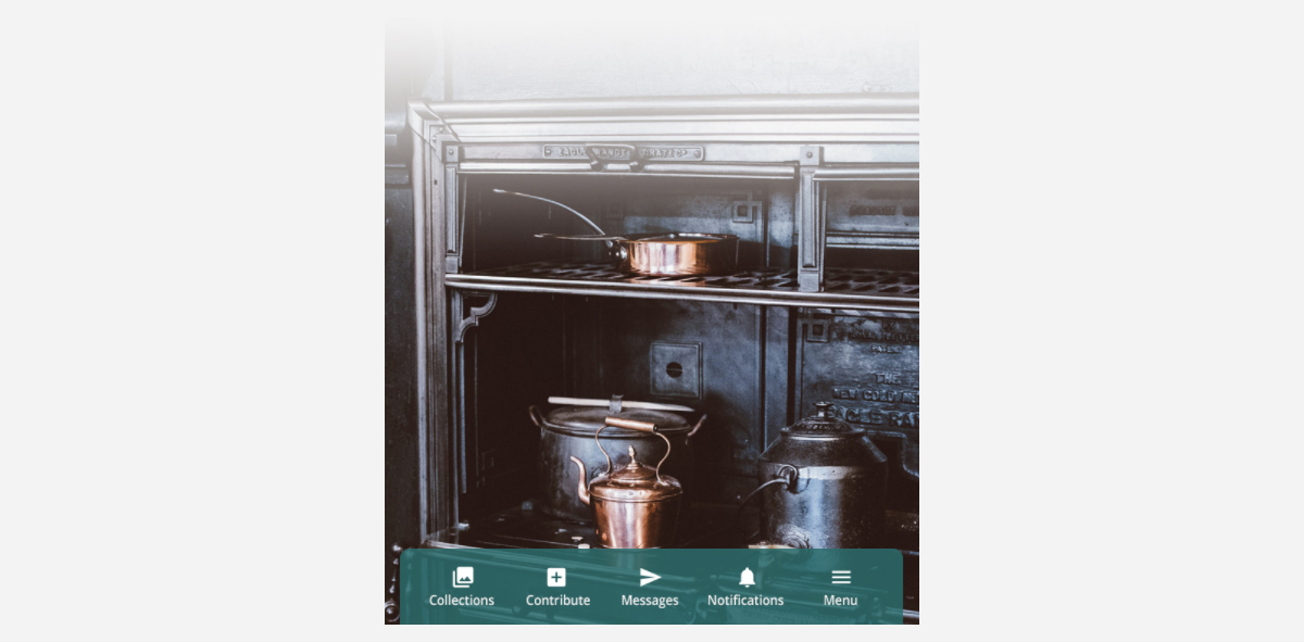
The mobile action bar is a unique navigation bar, integrated with our products. It works like a simple, fast navigation that points you to some of the most important pages or actions of your platform. It is very accessible for mobile devices and web-view apps.
How to manage the mobile action type
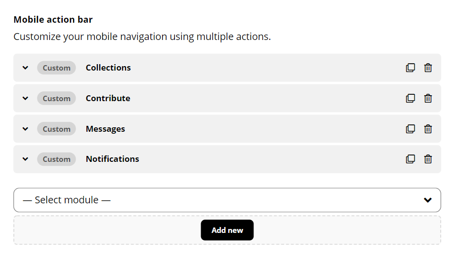
Navigate to your admin dashboard, then go to Listing Types Settings Theme Mobile Action bar.
Use the drag-en-drop interface to create new items, sort or remove navigation items. You can select a specific icon for each item, or create your own icon set.
With the custom menu item, you can point the users to any internal or external URL
Pre-defined modules
Using the pre-defined items, you can trigger specific action on the site:
- Explore page
- Submission page
- Messages
- Open notification panel
- Open favorites modal
- Open sign up modal / sign out
Show / hide menu items based on the user session
You can also hide a specific menu item for signed in/out users using the options Hide when logged out or Hide when logged in.
Side menu
The last entry in your menu will be the hamburger menu that opens the mobile navigation sidebar. This one is static and can’t be customized. The sidebar navigation will display your mobile menu location.

