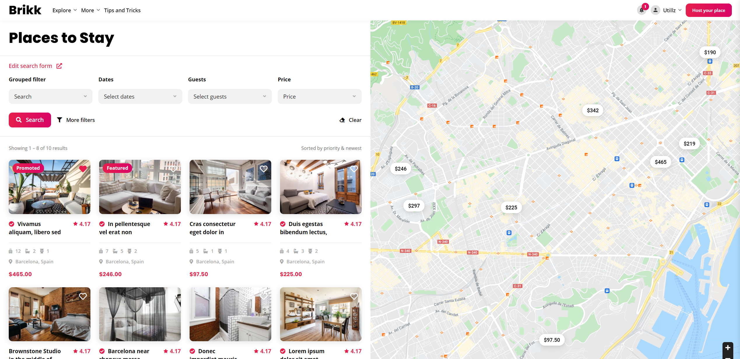
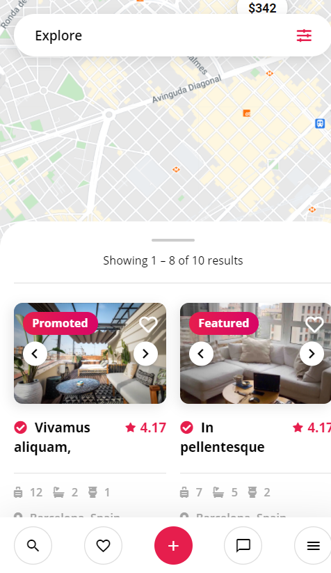
Our themes offer several listing layouts for your explore page, but if you need to go wild and add something that is not on the table you can use some simple css examples that we have created for you.
4 listings per row on desktop
.rz-listings .rz-listing-item {
    flex: 0 1 25%!important;
    max-width: 25%!important;
}
50%/50% – listings/map
.brk-explore .brk-explore-sidebar {
    flex: 0 1 50%!important;
    max-width: 50%!important;
}

2 listings per row on mobile
@media (max-width: 1199.98px) {
    .rz-listings .rz-listing-item {
        flex: 0 1 50%!important;
        max-width: 50%!important;
    }
}
